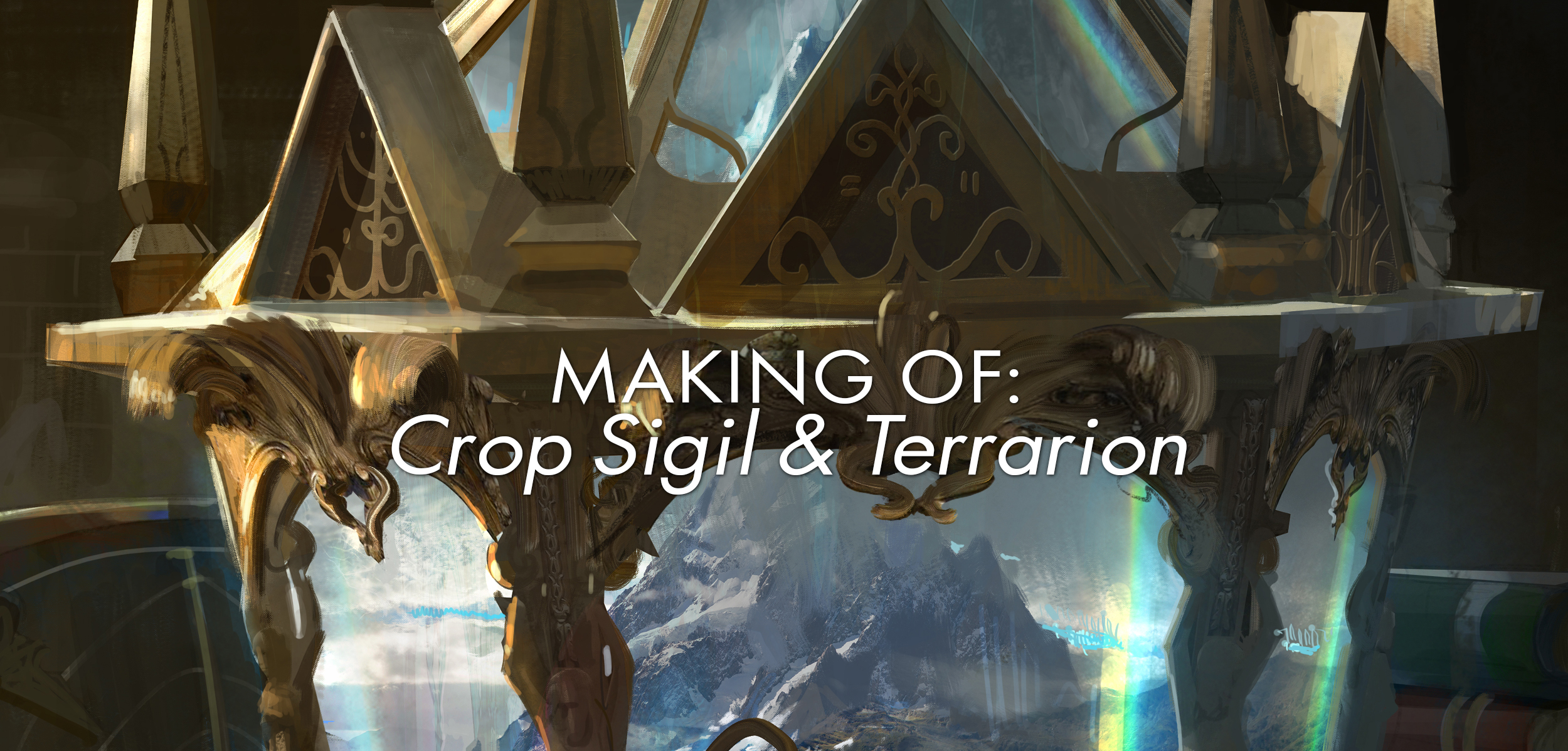
Making of: Crop Sigil & Terrarion
Hello fine folks of the internet and good people all around, this week it's time for the first installment of "Making of:" where we talk about how we go about making some of the things we do, pretty self explanatory huh? The goal of these is not to talk about the exact nitty gritty when it comes to brush size or which brush we used unless it's super relevant somehow but more the design choices involved. This week with the coming of Eldritch Moon in Magic: The Gathering I thought it would be cool to show the two pieces I have in that set, Crop Sigil and Terrarion (like the title, get it?). These pieces were a lot of fun to paint but also a real struggle since I was changing techniques at the time. Some general info beforehand:
Art Director: Cynthia Sheppard
Resolution: 8000 x 5466 (or something close to it anyway)
Programs: Photoshop CC, Modo with a hint of Daz.
Machine: PC Win10, Core i7, 32GB Ram, GTX970
But enough intro, let's get to it!
well, almost all...
Crop Sigil
Let's start with the official brief:
ART DESCRIPTION:
Setting: Innistrad
Color: Green spell
Location: In the farmlands of Gavony (see 37B, 38)
Action: Show a view from the top of a barn, looking down at some FIELDS OF CROPS where CULTIST PATTERNS have been BURNED—sort of like "crop circles," but using the shapes of the cultist symbols on 95. The result is a pattern of blackened, burned lines in otherwise healthy, green crops.
Focus: The patterns in the fields.
Mood: Weird stuff is happening here...
Ooooh! I remember when reading this for the first time I got really excited, this was a great opportunity to try out my new, and horrible, 3D skills. At this stage I was also asking for some other stuff than just lands so getting this was great. Dark mood, cool angle AND fire? Color me 30 hours lighter because Imma spend some time on this!
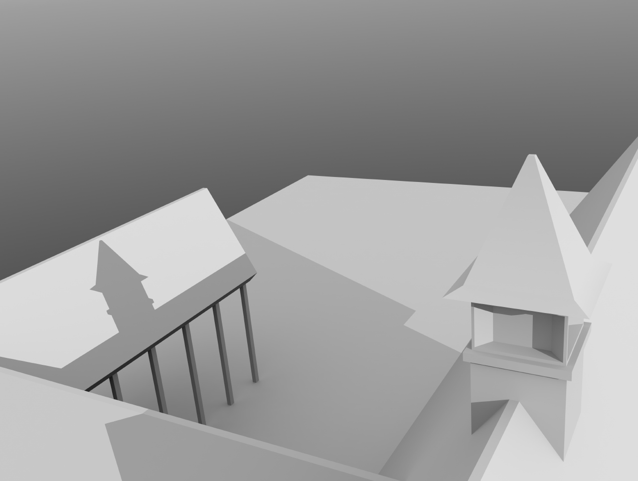
First things first, the 3D sketch.
Now for this I made the whole barn with my potato 3D skills and placed a few cameras so I could figure out which angle worked best. I wanted enough room for the field and the burning sign but at the same time I wanted to connect it to the viewer and the farmers. The people of Innistrad are a funny bunch and I knew they were going to go through some rough times, burning one of their fields felt like adding insult to injury and I wanted to show this.
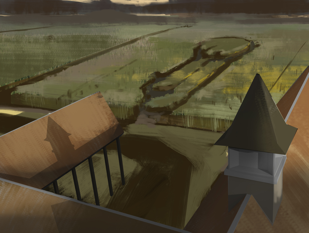
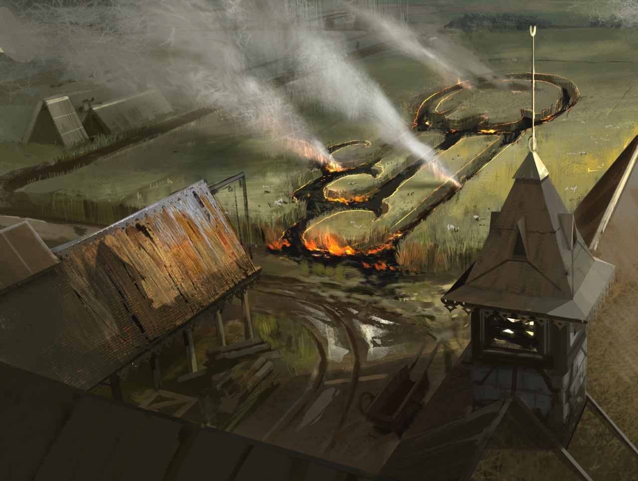
After a few in between steps (which you can see if you scroll down) I reached this stage which is a important one. Right now the burning sign is still a bit weird; it's stretched incredibly far and I was struggling getting the sky in. All elements in a painting, especially one that has to read on such a small scale, have to serve a very specific purpose. I was pretty happy about the colors, a little moody and dark! This would come back to bite me though, did not have enough range!
And the sky was like:
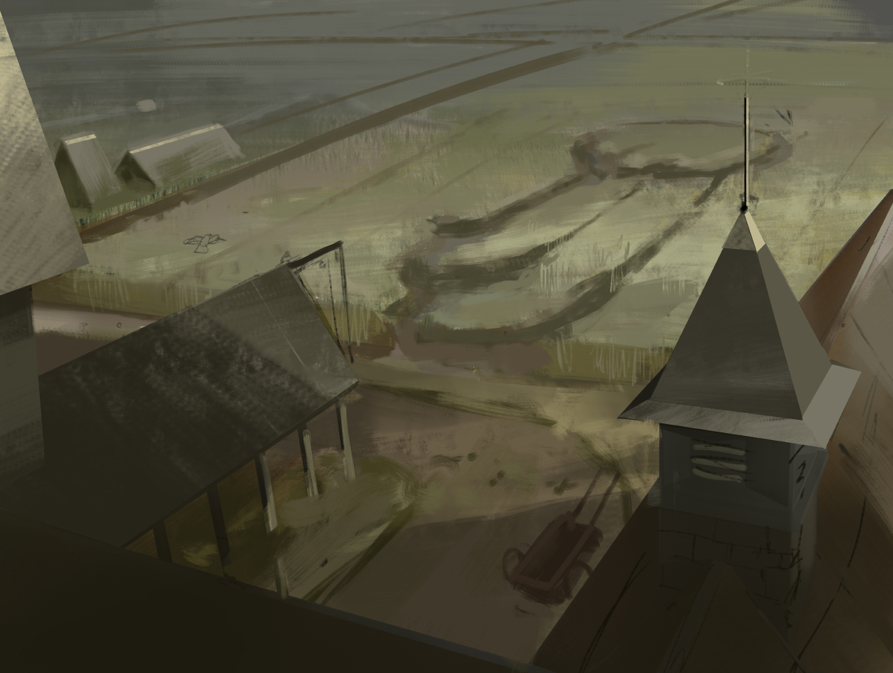
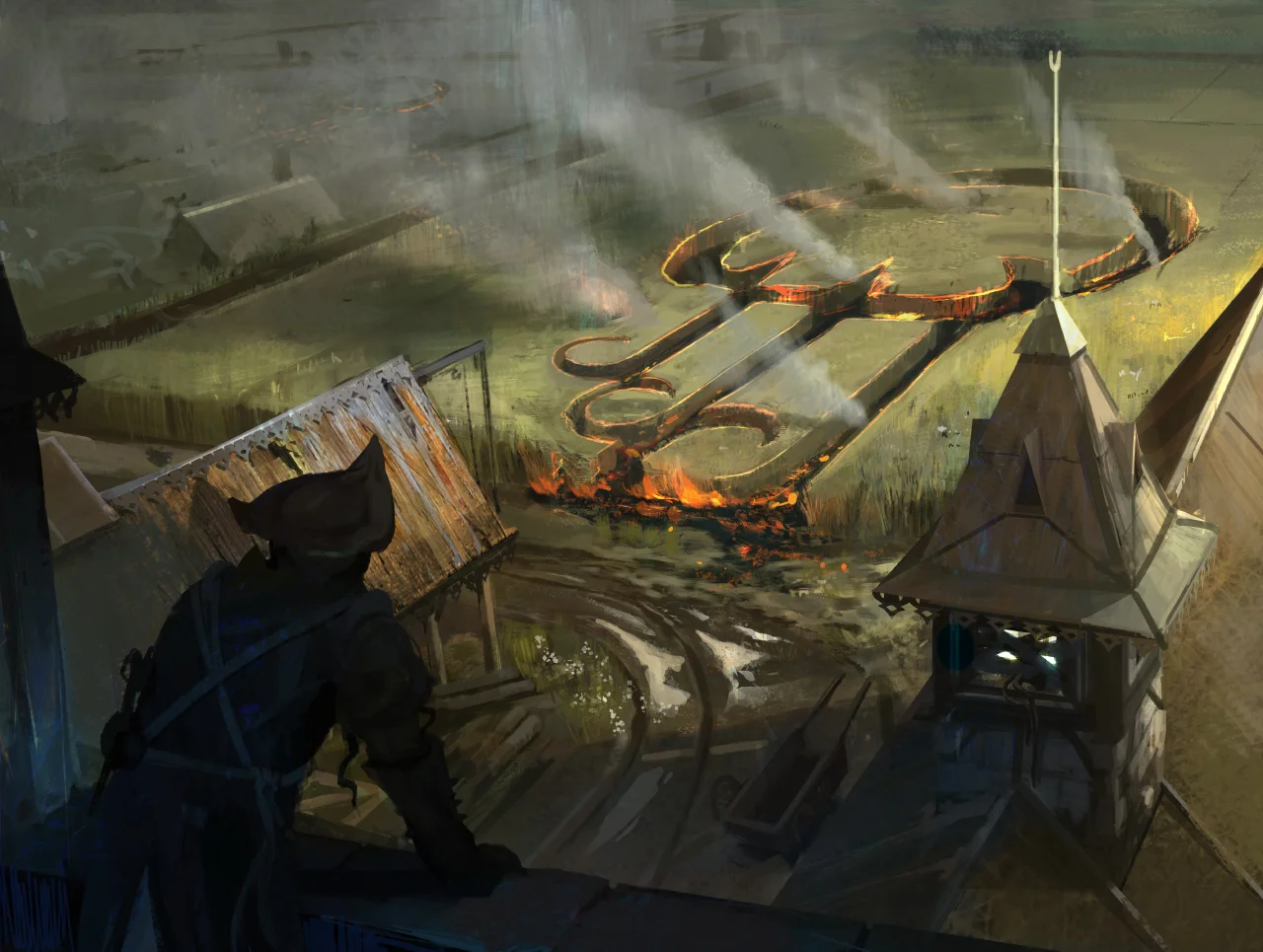
Now that the sky is gone it's time to make sure the viewer doesn't fall off the canvas. Innistrad is this weirdly claustrophobic place (and not the only phobia!) so I decided to put a tower on the left border. Normally we read left to right and gradients dark to light; reversing this doesn't often happen. It's why good guys ride in on screen left to right and bad guys right to left because it feels more jarring when bad guys do that. So, putting a tower on the left means the viewer cant go back that way and it feels a little bit more claustrophobic. The angular roofs, and triangles as a whole, are also considered more aggressive shapes. These counter the circular shape of the crop sigil and again emphasize a little bit of the dire situation. It's true that almost all roofs are triangular so this could be seen as artsy fartsy &*#*(@ but in this case it's all about how many are placed and where.
Want some fire with that smoke? Getting a little atmosphere going! Also, tower on the left has disappeared! It's important to note that during the whole process things get toggled on and off constantly. Doing this, including flipping your canvas and previewing it on a card, is important to keep a fresh eye and to check if your composition is actually any good. Adding details and noise is always cool so I just did some of that. Right now was also the time to think more about the setting; what kind of soil was it? Has it rained? What equipment do they use? Are they building something? How long did the barn go unattended? What kind of crops are they? Asking these questions helps a lot when thinking of new details, like the cart and it's tracks and some building materials. Also; when leaves and crops are really wet the smoke is more white which is what I wanted, small things like that help!
And now for some final touches...
My buddy Victor helped me get a character in there which really tied the painting together. The tower on the left is also back in, yay! Add some shadows etc. So this whole piece is about jarring angles, shapes moving against each other in harsh ways and muted tones versus the rounded shapes of the sigil and the sharp high saturated orange of the fire.
Roundup:
So here is what I like and don't like about this piece.
Pro's:
- I like the angle / composition, it shows exactly what I want
- Addition of character added a new layer of depth to this piece
- The light and dark helped
Cons:
- Angles on the roof are too sharp, need to use less polygonal lasso tool
- Some of the colors / contrast is wack. It's all over the place! Blurgh
- Some of the textures in there make absolutely no sense. Just, none. Just weird noise
Here is a GIF which for some reason doesn't loop (just open it in a new browser tab if it doesn't work)
Terrarion
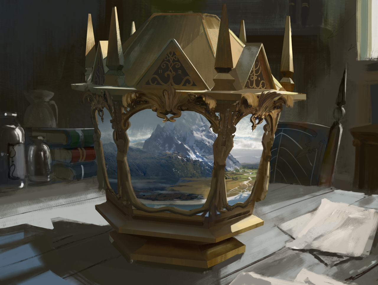
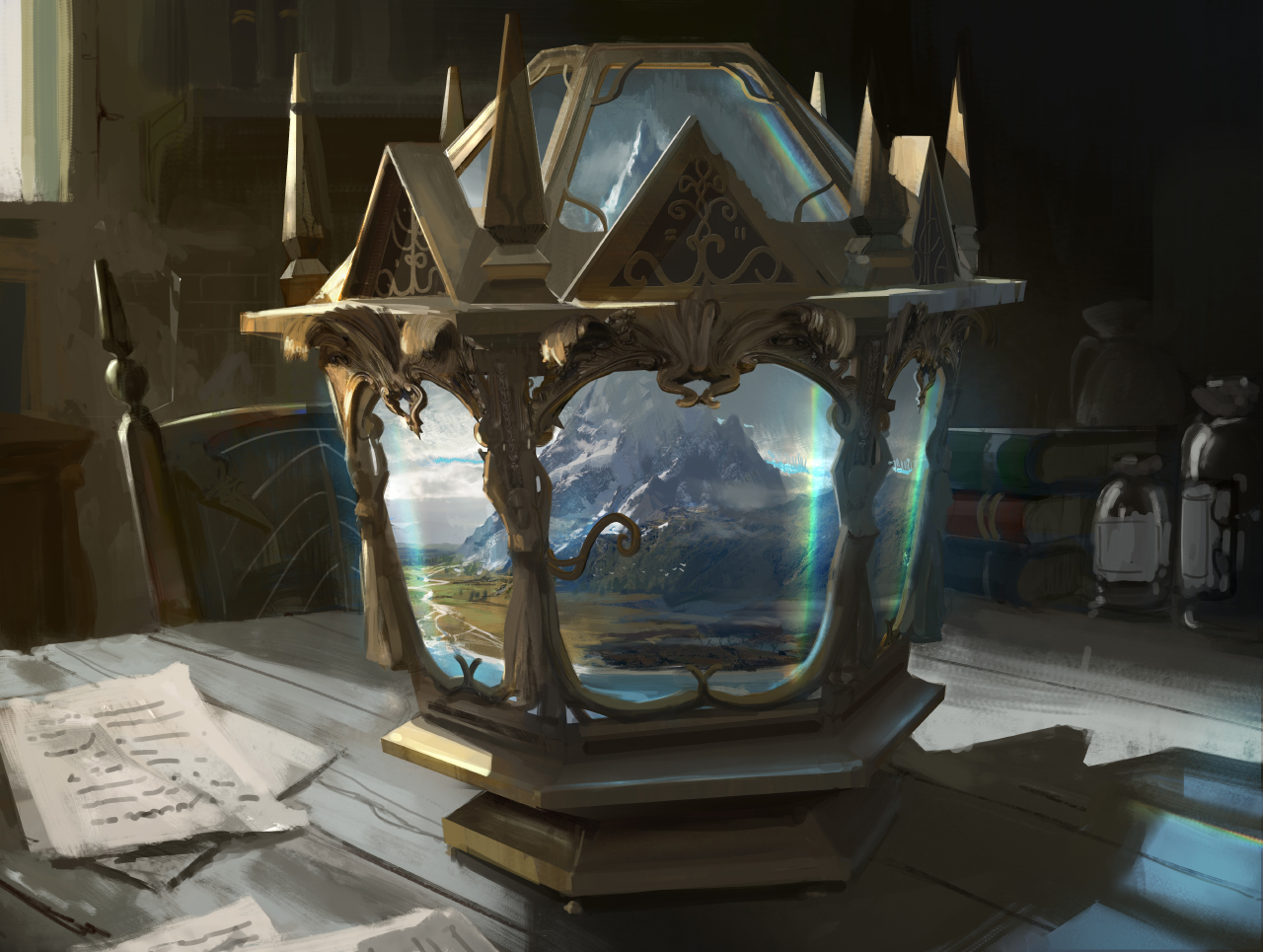
Aawwwwww yeah, as far as fun cards to do go this rocketed into the top 5. Artifact, lands, doesn't get a whole lot better than that. On top of all that it was actually a reprint of a card from one of my favorite blocks, Ravnica.
The brief:
Setting: Innistrad
Color: Colorless artifact
Location: On a table or windowsill (precise location unimportant)
Action: Show a small TERRARIUM shaped sort of like a glass lantern, with an elaborate base and lid. Inside is a WHOLE LANDSCAPE in miniature, including ALL FIVE terrain types: Plains, Islands, Swamp, Mountains, and Forest. (For example, we see a coastline in the front, with a swampy area at one end of it, then an expanse of plains, then forest covering the lower slopes of a mountain range in the background.) The landscape is too big to be contained in this small container—the mountains seem to fade into the distance far beyond where the back of the terrarium would be.
Focus: The terrarium.
Mood: This is an exotic and mysterious item, bending the rules of space to give access to mana of any color.
Look at the brief, it's a thing of beauty. Clear but still with challenges, just what a artist needs. The moment I read this brief I had a clear idea of what I wanted, it's pretty rare because normally I have doubts and go back and forth quite a bit.
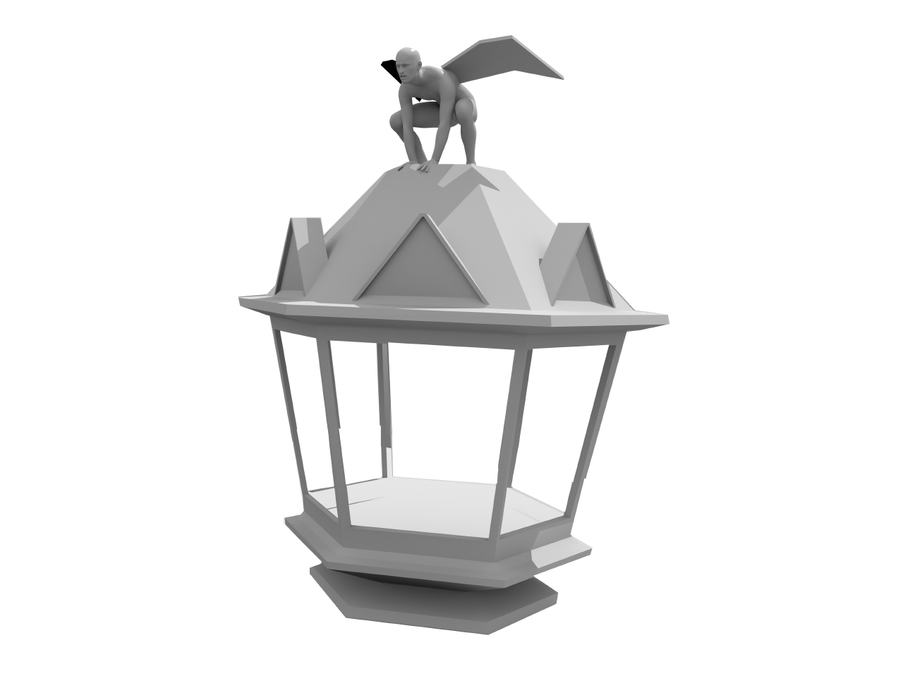
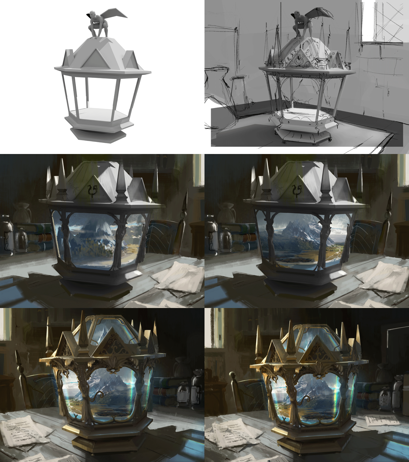
First, a terrible 3D model so I would get the perspective right. I tried freehanding it but when I wanted to rotate the camera twice it meant redrawing everything. Uncool man. Uncool. The model was made in Modo with the dude posed in Daz then also imported into Modo. I grew up using Maya and Sketchup (which I used a lot for Forza Horizon 2) but Modo has a incredible renderer and easy light setup that works wonders for exteriors so I went with that (also because Chase Stone uses it and he's so good. #imitation)
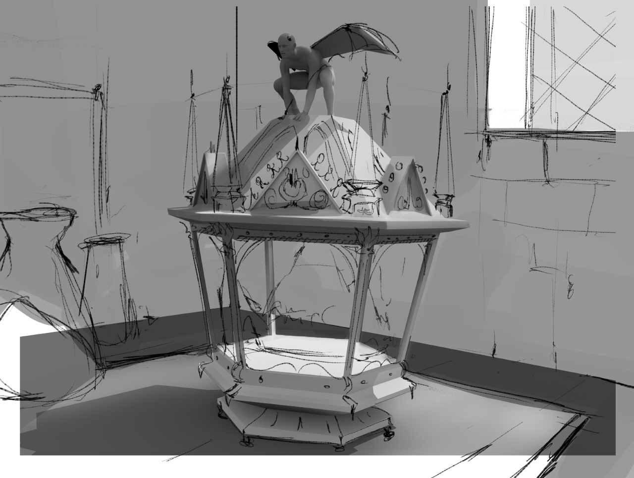
Well, that sketch pretty much is the final piece already, like I said, clear vision. It was important to get all the values right so I actually stuck with greyscale longer than I normally do. These sketchlines are something I do all the time, they don't really show up in the WIP's but I constantly draw over my own work in lines to see if I can't push the design / painting. I also wanted this piece to be super ornamental like suggested in the brief so I did some research on Art Nouveau bronze and brass decorations. The technique used would be a mold so it would always be a bit crude. The carving in the top would not be mold but cut plate so it could be much more fine.
Not something I do a lot, keep the painting greyscale for so long. The process of using a color layer to fill everything in like some of the greats do (Tyler Jacobson and Adrian Smith) is stupidly difficult. I mean, just dumb. You think it's easy but then after 10 hours you just want to torch your PC. However, I did it and by a miracle it worked out.
Oh look at that fast forward. It's... erm. What's a good movie where they travel to the future? Not demolition man because he was frozen, that doesn't count. Anyway, yay! One of the fun parts in working on this image was that I could really focus on 1 area. Everything inside the Terrarion and the Terrarion itself would receive a lot of detail and the rest not so much. It helped me focus and get a lot done. Sometimes I get totally lost in a ocean of detail and it doesn't really benefit the painting a lot. Over the course of the next 6 months (and I'm talking August 2015 till about February 2016) I was going back and forth with this process a lot. It's something I'm still not really comfortable with to date but it's getting better. Artistic growth, yay!
Mixer brush is your friend. That is all. Flipping it because I want the chromatic flare to be really obvious and one of the last things you see. Trapping it in dark also means that it's not super easy for the reader to go out meaning you keep staring at it.
It isn't a complete article without cats!
All right, roundup time.
Pro's:
- Nice distribution of detail, was a first, liking it.
- COLORS! Color contrast is working out pretty well.
- Readability. Very easy to see whats going on.
Cons:
- Still too loose in some points, up close this piece is a disaster
- The perspective is forced weirdly because of the angle of the chair which makes the whole thing look lob sided. #cantunsee
- Even tho it reads the angle is still a bit so,so. Maybe could've added more drama.
OKGIFTIME. If it doesn't loop just open it in a new browser. I will fix this at some point!
Well that's it for this week. If you have any questions on some specifics just give a shout in the comments and I'll do my best to answer them. It's hard to know in how much detail I should go.
- Titus

