Making of: Dynavolt tower
Hello dear friends and good folk of the internet all around. It's that time of the year where we say goodbye to the sun, at least here in the northern hemisphere, and hello to the rain and cold, at least here in Sweden. What better time to snuggle in with some hot chocolate milk and some spreadsheets to determine the best point value for drafting, or just go here. Yes, that's right, I'm talking about Magic: The Gathering!
With the release of Kaladesh I thought it was high time for another 'making of'. This piece marks a pretty interesting time in my personal style of painting, one where I struggle like crazy to let go of my concept roots and try to imitate what I think an illustrator is. The lost art of patience is something I made myself very familiar with over time.
So let's just Dive on in!
Did I ever mention I am a huge American Dad fan?
Dynavolt Tower
Let's start off with the brief, as art directed by Cynthia Sheppard:
ART DESCRIPTION:
Setting: KALADESH
Color: None (artifact)
Location: Any Kaladesh interior space (see p. 37-39)
Action: This is a large, impressive "aetherpunk" version of a Tesla coil, a device designed to store up energy and then discharge it all at once in an impressive display. Maybe we see it filling a large gallery like on p. 37, discharging bluish electric bolts in multiple directions. If you like, you could show one or more glass-and-filigree reservoirs for aether, the fuel source for this wondrous device (see p. 22-24 for examples of what aether looks like in glass pipes/reservoirs).
Focus: The Tesla coil-like device
Mood: An inventor's version of an impressive light show.
Notes:
When I read this I instantly knew I had to make a 3D model of it. I don't do this very often since I'm pretty slow at it and it more often than not it constricts like crazy but I had some ideas that I wanted to explore. One of the key reasons was that I wanted to find a cool low angle composition that showed off all the elements. Drawing and redrawing these can take a lot of time, got to keep that efficiency in mind! So how good are my amazing 3D modeling skills?
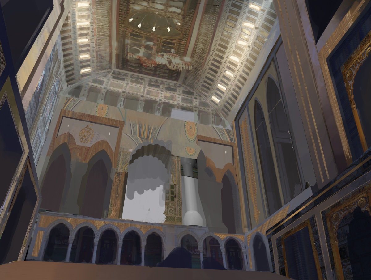
Pretty bad. The answer is pretty bad. However, they are good enough to get something quick down and I can iterate from there. From here my concept art brain kicked into overdrive and I started slapping in photo's from my trip to Istanbul. It led to the following sketch that I sent for submission. This might be my least favorite thing I've ever made in the history of ever:
I sometimes do wonder how I am still employed, then I realize most people think this, I buckle down and get things done. In the famous words of one of my favorite streamers; it is sadbad. Cryfrownbad.
Ok so, there are a plethora of things wrong here. The stairs, the pipe in the bottom, the pipes in the back just look nonsensical. The Tesla coil feels underwhelming, scale is unreadable, etc and so forth. I was trying to rush it at this point for no good reason. Patience.
Cutting, pasting, stretching. Starting to look a bit more impressive scale wise. The hall around it still is the worst thing ever. Kaladesh is a lush, decorative place. Filled with details and plants and magnificent inventions. This image right now looks like a miniature of a basement with the next generation of electrical toothbrushes in the works. A big fat nope, so, let's mix it up.
The two windows on the right in the previous image have been stretched and pushed back in this one. The door has been beefed up a bit as well. If you look closely you can see the remnants of the original composition reflected in the new one. Even if you start over it doesn't mean you have to throw away ideas.
When in doubt, just repaint the whole thing. Which is exactly what I did. I used some more photos from my Istanbul trip and a few from a trip to Warwick Castle. All the while I had reference open on Indian and Kaladesh architecture to make sure I would stay on point. Use the right shape language and so forth.
One of the major changes is that the 3 point perspective is pushed to the max. This tower is supposed to be impressive which, in an interior, means a low angle shot. You can do other things but there is a good reason why a low angle works. Cathedrals, who use a super high ceiling (forcing a low angle) are fantastic in inspiring a sense of awe. It makes us feel small and almost insignificant.
Another thing to remember is that cultural appropriation and making sure you do justice to said culture is incredibly important for Wizards and me as well. At the same time it's important to remember that all of these worlds are fictional. There are a lot of reasons why taking too much from real life is a no go. After all, Magic is a game about killing monsters and defeating your opponent, along with having a good time.
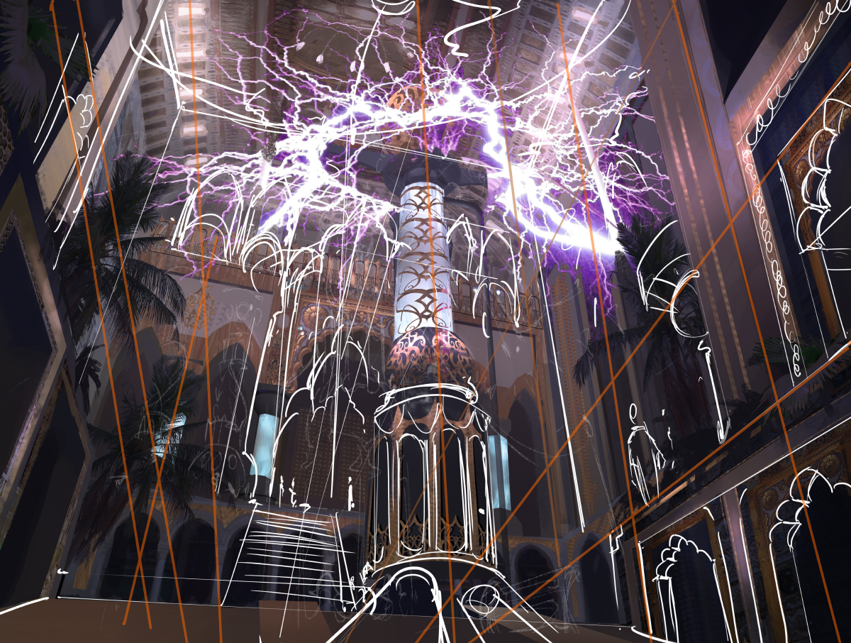
Some filigree patterns and what it looks like when I sketch. It's pretty chaotic! Progress is shaping up pretty nicely. The trees are helping a lot but the lightning is still too much. This process is a constant back and forth. Looking at every element and wonder if it works. What you don't see in these WIP shots is just how often I toggle on black and white mode to check my values, or flip my canvas to check perspective and weight. It's an ongoing struggle. You against yourself reflected in the work you're doing. In the end it really boils down to how honest you want to be with yourself. Since the old adage goes; you don't know what you don't know you have to make sure that you at least learn to see your own mistakes. It might be a gut feeling or you meticulously applying the rules, or a mixture of both. Do whatever you need to do to find those points that need improvement.
Don't just say: "I already know how to do this so I don't have to worry about it.". This is something you will rarely, if ever, hear a pro say. It doesn't mean that you don't understand the fundamentals or are just too humble, it simply means there is room for improvement and the second you are too lax a mistake might sneak in and kick your ass later on.
That feeling when you spot a mistake and it's too late to fix efficiently so you have to repaint the entire thing just because you were too lazy to properly look before.
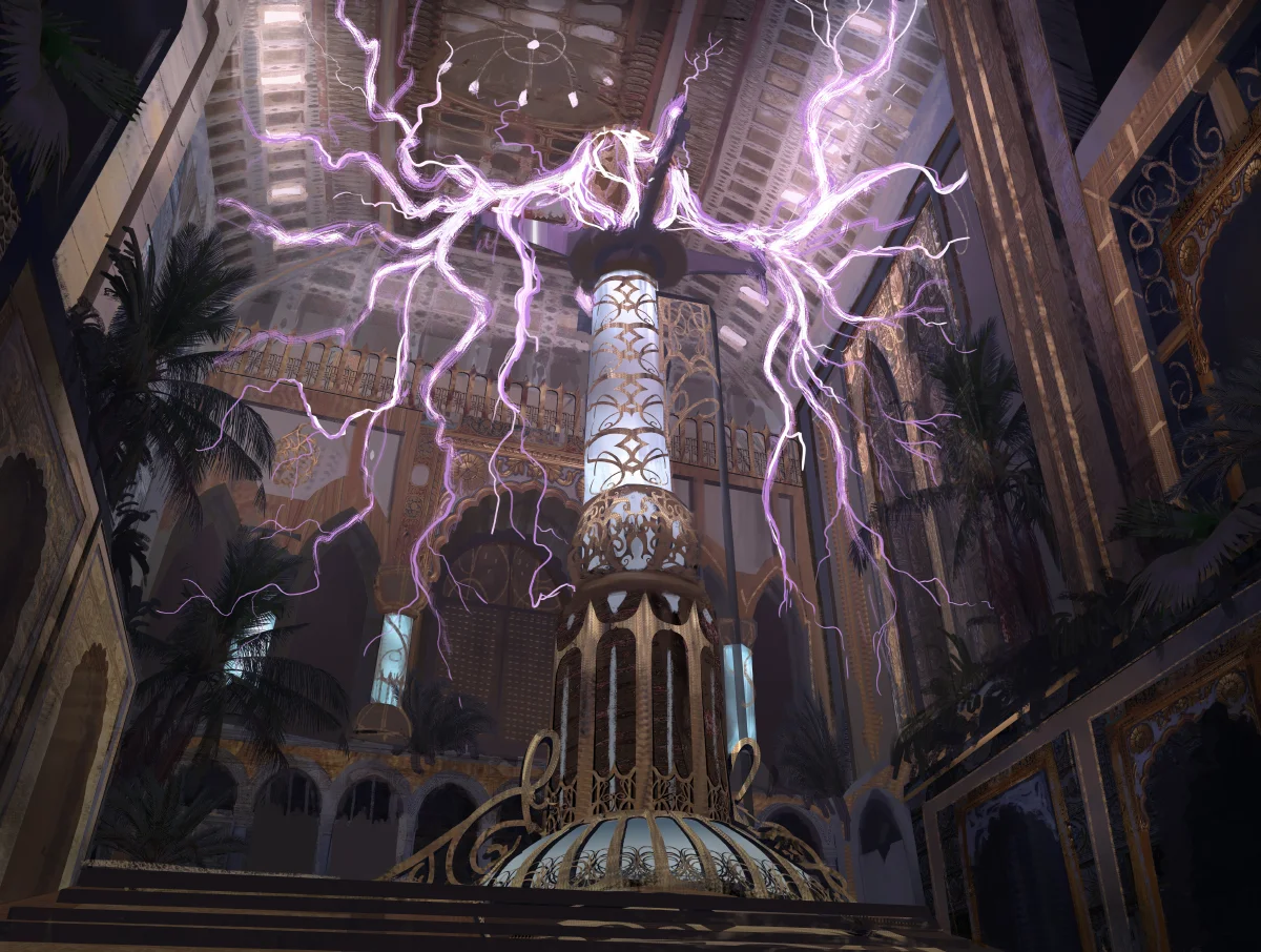
Alright, almost done. Still some life missing from the piece. Lighting feels kinda dead and non existent, lot's of glow and reflection missing. This is a final touch so it's tricky to see past it. Much of this process is also about learning to see where the piece will go long before it's done. This for the most part is down to experience and getting comfortable with making images, even unfinished ones. This is why it's important to make as much stuff as you can; you don't have to finish all of it!
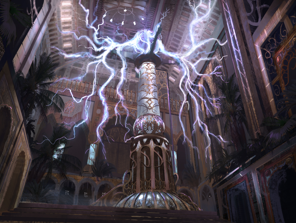
So here is the finished version:
Bbbbzzzzzzzzzzzzzzzzzzzzzzzzztttzz zzzzttt
And of course the final card:
As per usual there are a lot of things that I would do differently now, which is a good thing! It means that you can see where you need to grow. If you can see it, you can improve it. Even though I cringe looking at all the mistakes. Also, I love the actual card! I think the mechanic is a lot of fun and I can't wait to build a deck with it. Now it's time to go out, get some Kaladesh boosters and enjoy the weekend.
Thanks for hanging out, have a great day and weekend wherever you are or whenever you are reading this. Take care,
- Titus
Also, a big source of inspiration for this piece: (Think I hit about 4 hours of Tesla coil videos watched and another 10 reading about them)
Small editors note: This article was supposed to feature the making of Burgeoning as well but unfortunately I have been too sick with the flu all week to properly get it done. At some point I will do a write up on that one too.


